
Click here for a larger version.
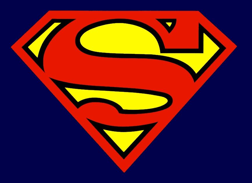
While the purists may have some problems with the design [a bit too rounded at the top] I like it fine. It's also a bit darker than I expected too. Here's a quick comparison with the shield logo used in the current comics:
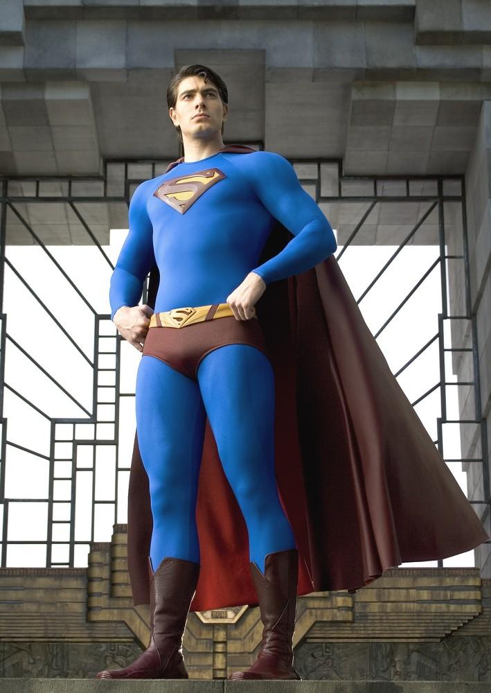
I think the biggest problem that the producers had is the simple fact that Superman has had a fairly consistent design for about 75 years. Unlike what was done with the X-Men, you can't put Superman in black leather. Here's a publicity shot of Brandon Routh in the new costume:
 Courage,
Mike G.
p.s tune in tomorrow for Great American Bash Preview talk.
2 comments:
I have more of a problem with the "S" belt buckle and the dark red cape/boots than I do with the logo... although I don't think it should be 3D on his chest. I think it should be smooth and part of the material of the suit.
Just my $0.02
It gives a sense that the shield was designed as an individual piece. The traditional idea was that the costume was cobbled together from the blankets he had on board with him.
Post a Comment